Joy of Living
Brand Guidelines
These brand guidelines define Joy of Living’s distinct identity, including our voice, tone, colors, and logo usage. They establish a consistent brand experience, guaranteeing that all communications embody our mission and values.
These guidelines offer a framework that fosters creativity while maintaining Joy of Living’s integrity, allowing for adjustments in different contexts without undermining our fundamental identity.
01
Brand Identity
-
A world where meditation is a part of everyday life, and peace, joy, and wisdom radiate from within.
-
To transform hearts and minds by making the ancient wisdom of meditation accessible to the modern world.
-
Generosity: A spirit of sharing is at the heart of all we do.
Ethical Conduct: We consciously commit to avoid harmful actions and engage in virtuous deeds.
Patience: We give ourselves and others time and space to navigate all challenges.
Joyful Effort: We take our work seriously but carry ourselves lightly.
Meditation: By training our minds, we cultivate focus, balance, and equanimity.
Wisdom: We know we have much to learn from each other and the communities we serve.
02
Logo
Our logo builds and strengthens our brand identity. This section explains how to use it through its main applications. The Joy of Living logo consists of two primary elements — the dharma wheel with practitioner graphic and the wordmark "Joy of Living" in Rotis Semi Serif font.
Full-color Logo
Our full-color logo represents the essence of our brand. It is essential to use the specified colors to maintain consistency and maximize brand impact. Both color versions are acceptable and are best suited for use on light backgrounds.
Secondary Logo
The vertical logo is for large format designs. Avoid using it in small designs.
Symbol
The symbol can exist without the wordmark, but the wordmark should never exist without the symbol.
Logo on Backgrounds
The monochrome logo should be used over colored backgrounds, photographs, or when printing restrictions apply.
The dark logo should be used over light-colored backgrounds. The white logo should be used over dark-colored backgrounds.
When in doubt, use the most legible version of the logo for that particular background.
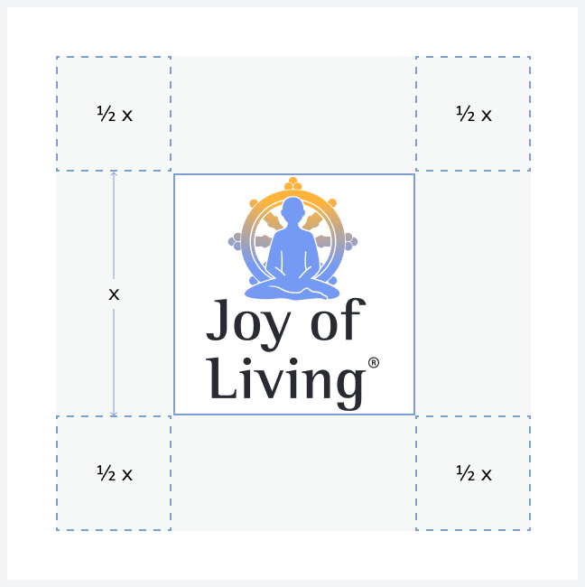
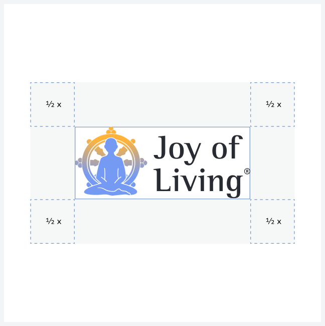
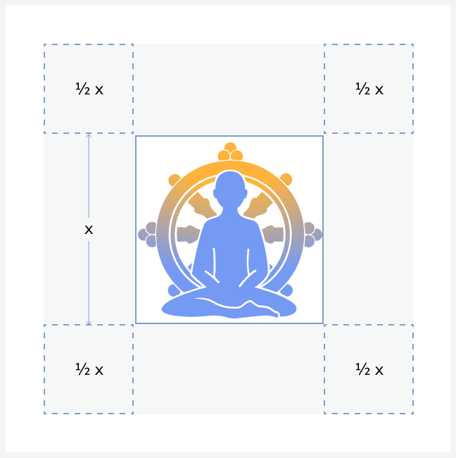
Safe Zone
A clean space must surround the logo to ensure its visibility and impact.
No graphic element should invade this space. The logo and the symbol’s exclusion zone are equal to half the height of the symbol.
Minimum Size
Establishing a minimum size ensures the logo is fully legible.
The minimum size for the primary logo is 100px in digital or 20mm in print.
The minimum size for the secondary logo is 50px in digital or 10mm in print.
The minimum size for the symbol is 30px in digital or 10mm in print.
Dont’s
The logo or symbol should not be cropped.
Logo elements should not be scaled, distorted, or change the composition between them.
Avoid adding shadows or any other graphic elements.
The logo should not be altered to use colors that are not specified.
No graphic element should invade the safe zone.
The wordmark must not be used without the symbol, be manually written, or have its typography changed.
03
Color
Core Colors
Logo Palette
This palette comprises the colors used in our logo. These colors can also be effectively employed for other prominent elements, such as Call-to-Action (CTA) buttons and accent features.
Solar Amber
R37 G100 B62
C0 M30 Y77 K0
#FFB33B
Serene Blue
R223 G85 B71
C52 M37 Y0 K4
#759AF4
Midnight Black
R228 G11 B18
C42 M43 Y0 K80
#292B33
Text Palette
The colors in this palette are specifically chosen for use in text elements such as headings, body text, and captions. They are selected to ensure optimal legibility and visual harmony within our brand's design language.
Space Blue
R66 G74 B88
C76 M64 Y46 K31
#424A58
Gradient Colors
Concept
The concept is based on the various shades of the sky — pure, vibrant, and subtle.
Why the sky? The sky represents our true nature, our basic goodness — boundless, beautiful, and transcendental. Different times of day — sunrise, midday, sunset — correspond to various stages of the path and Tergar products.

“Awareness is like a crystal or mirror that reflects different colors and angles: forms, sounds, and feelings are different aspects of awareness and exist within awareness.”
Gradient Application
The gradient is radial, with a color location of Orange (#FFB33B) at 0% and Blue (#759AF4) at 72%. The total fill of the gradient is set to 30%.
This version is recommended for designs where a soft blending effect is needed. The gradient application can be adjusted as necessary, as long as the colors remain unchanged.


Tint & Base Colors
This color palette is composed of variations of the core colors that create a visual hierarchy in all designs.

Base 05
R103 G116 B138
C66 M50 Y31 K6
#67748A
Base 04
R193 G199 B209
C24 M16 Y11 K0
#C1C7D1
Base 01 (White)
R255 G255 B255
C0 M0 Y0 K0
#FFFFFF
Base 02
R249 G249 B251
C2 M1 Y0 K0
#F9F9FB
Base 03
R247 G247 B247
C2 M1 Y1 K0
#F7F7F7
Color Accesibility
Contrast is essential for ensuring design accessibility. By meeting accessibility standards, we ensure that text remains legible for all users, including those with visual impairments.
The JOL brand colors offer a range of brightness and contrast levels, which we carefully consider when pairing type and color. For small text (16pt or smaller), we aim for a contrast ratio of at least 4.5:1. For larger text, a contrast ratio of 3:1 is desired to maintain readability and accessibility.
Foreground: #001F6B
Background: #759AF4
5.46:1
Foreground: #FFFFFF
Background: #759AF4
2.73:1
Foreground: #3E6FE4
Background: #FFFFFF
4.57:1
Tergar Gold


Foreground: #663E00
Background: #FFB33B
5.22:1
Foreground: #FFFFFF
Background: #FFB33B
1.79:1
Foreground: #CD8410
Background: #FFFFFF
4.95:1
Legend
Great for both UI elements and normal text

Serene Blue


Usable for UI elements and large text, but not normal text
Not recommended for UI elements
or text
04
Typography
We use a combination of modern and classic typefaces to create a clean, inviting look across all communications. The balance between these fonts ensures a cohesive and engaging visual identity.
Download Rotis Semi Serif
Nunito Sans
Clean and versatile, Nunito Sans is our primary typeface, ideal for both titles and body text.

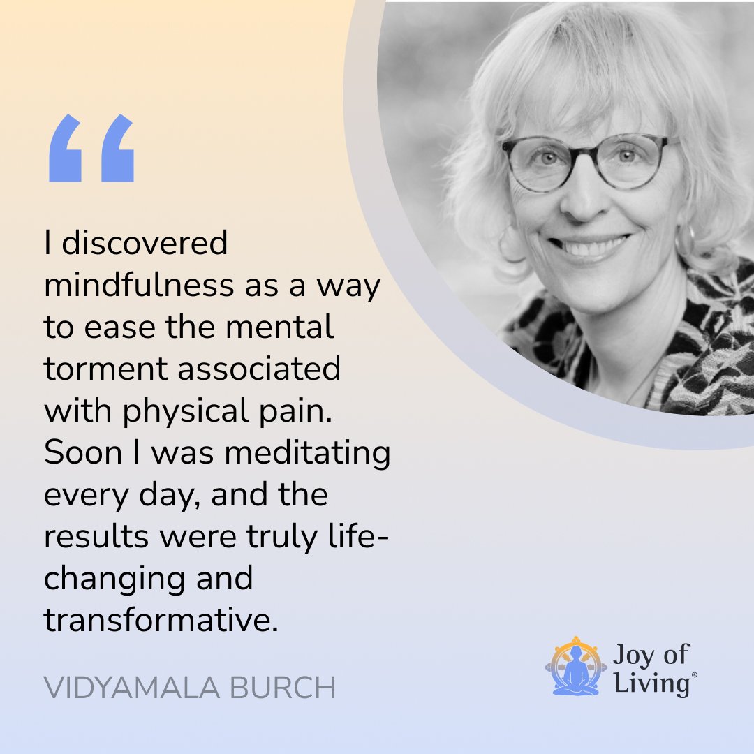
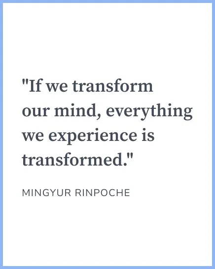
Source Serif Pro
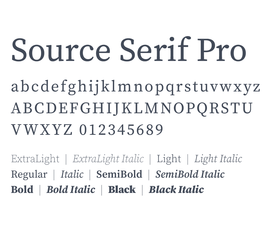
Perfect for quotes or accenting headings, Source Serif Pro complements Nunito Sans beautifully, adding a touch of tradition.
Rotis Semi Serif
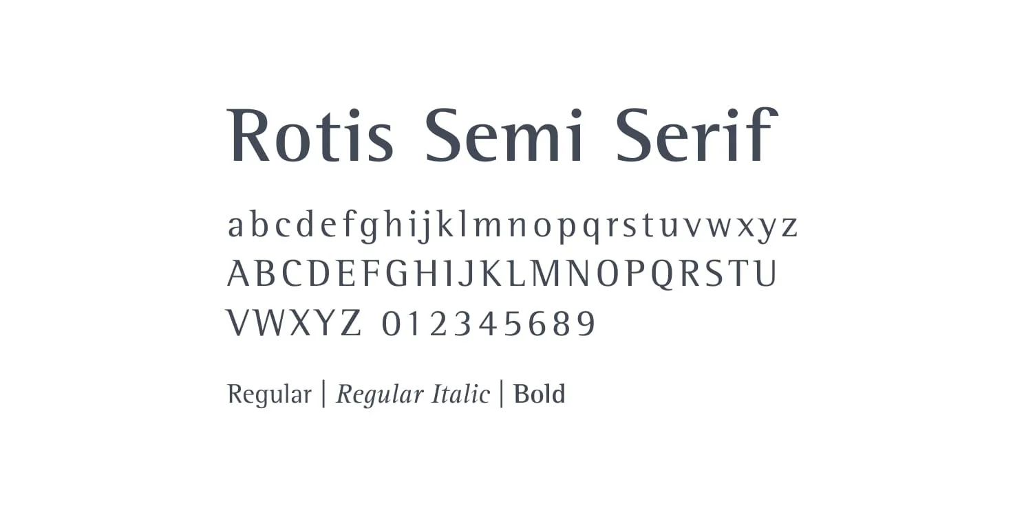
The typeface has a gentle, human quality. Its subtle serifs and balanced proportions create a sense of warmth and approachability, inviting people in rather than keeping them at a distance. There's a natural ease to how the letters ground themselves while remaining open, much like the way meditation helps us find stability while staying receptive to life's flow.
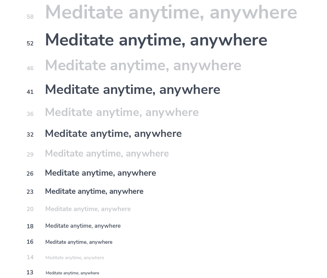
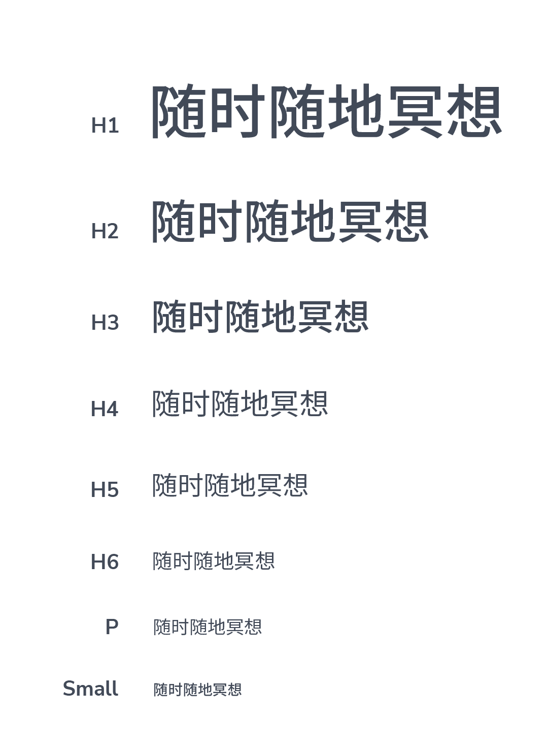
Type Scale
We use the Major Second type scale (1.125) with a key base size of 16px.
While we suggest using these eight scales, feel free to customize the type scale as needed. You can adjust sizes, add or remove styles, or even change the weight to better fit your design.
H1 Bold 52px
H2 Bold 41 px
H3 Bold 32px
H4 SemiBold 26px
H5 SemiBold 23px
H6 SemiBold 18px
P Regular 16px
Small Bold 13px
Typographic Applications
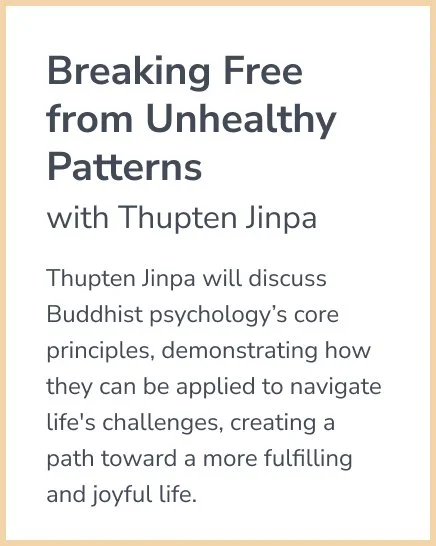
This visual guide showcases how Nunito Sans and Source Serif Pro can be used together.
Notice how the clean lines of Nunito Sans balance the classic feel of Source Serif Pro, creating a harmonious and modern aesthetic.

Localized Languages
For languages not supported by Nunito Sans or Source Serif Pro, use the Adobe Originals typeface Source Han Sans.
Bold fonts may vary across languages, especially for CJK characters, which may require larger sizes for readability. Different languages also have varying lengths, so adjustments to font size or layout may be necessary.
Feel free to play around with the font weight to ensure it looks right for each language.
05
Artwork
collection
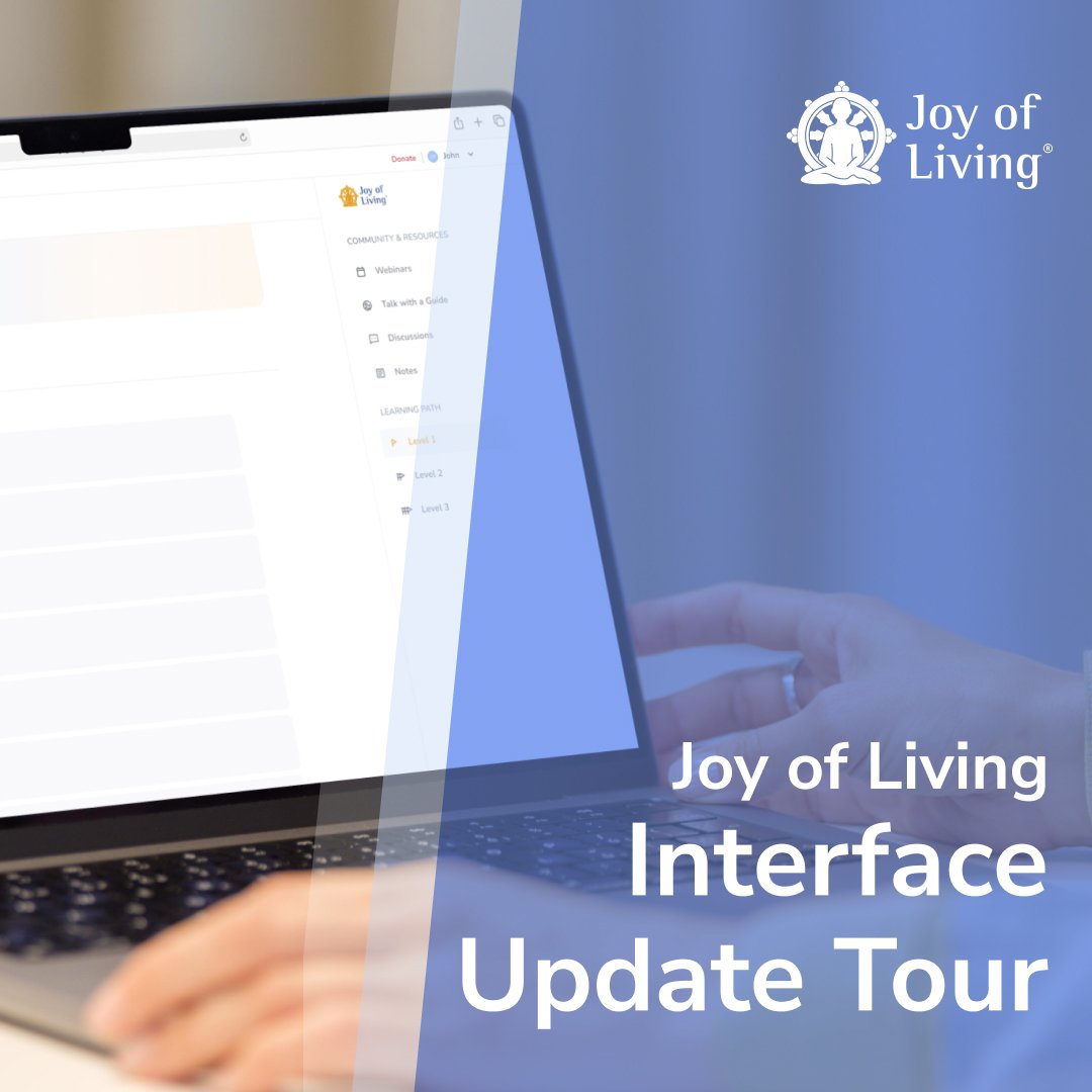
Initially designed for event promotion, these guidelines can be used for any situation requiring artwork. Additionally, specific elements were chosen to enhance the overall design coherence.
Element of gradient color or white with transparency depending on the background on which it is applied. This element can be presented in circular, curved, or straight line form.
It is proposed to use the gradient along with its variations, in groups of two colors or as solid colors. These colors can appear in backgrounds, filters for photos or in elements with transparency.